5 min read
14 mascot design examples worth studying
If you’re researching mascot design examples, you’re probably in one of two places:
- You’re a designer trying to figure out what separates a Duo from a forgotten cereal box character.
- You’re a founder or marketer deciding whether your brand should have a mascot at all.
This post is for both groups, because the answer turns out to be the same: the mascots that last are built differently from the start.
We run a mascot studio. We’ve shipped characters, watched some become beloved, and watched others quietly disappear. The pattern is consistent enough that we’d bet money on it.
The mascots that endure weren’t lucky. They were designed with clear constraints, emotional range, and product integration from day one.
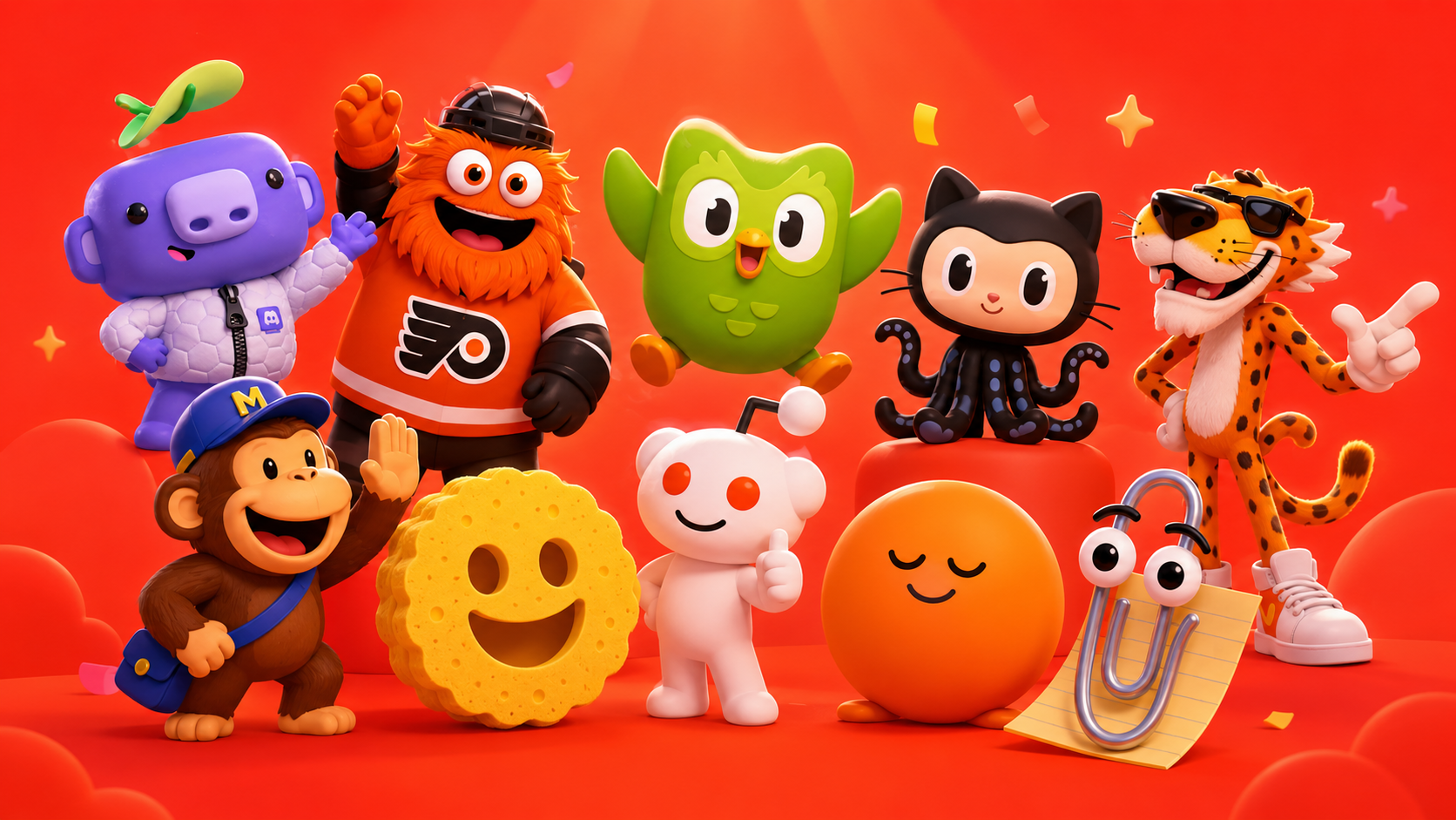
Here are fourteen worth studying, and what each one teaches.
Emotional range & expression
1. Duo (Duolingo)
Duo is deceptively simple. Big white eyes, a beak, and eyebrows doing most of the emotional work.
Yet Duo has more emotional range than mascots with ten times the visual complexity because the design was optimized for expression. The eyebrows do almost all the work. When Duolingo leaned into the “passive-aggressive language teacher” bit, the character was already capable of it. No redesign required.
Takeaway: Ask your designer what the mascot’s worst expression looks like before approving the friendly one. If the character only works when smiling, it’ll fail the first time you need it to deliver bad news.
2. Mojo (ClassDojo)
Mojo is a green rectangular monster with one antenna, designed to make abstract emotional concepts like empathy and perseverance feel safe enough for children to engage with.
The shape language does most of the work: rounded, stable, low-threat. There are almost no sharp angles, and that’s intentional.
Takeaway: Shape communicates meaning before color or styling does. Most mascot briefs jump straight to “make it cute” without asking what the silhouette should say.
3. The Headspace dot
A circle with a face. No limbs, no costume, no backstory.
Headspace understood that the mascot’s job was to feel calm and unintimidating. A simple circle accomplishes that more honestly than a fully-rendered humanoid ever could.
Takeaway: Restraint matters. Most mascot briefs are overdesigned. Sometimes a shape and a face are enough.
Product integration matters more than lore
4. Wumpus (Discord)
Wumpus has lore. Discord has published plenty of it. Almost nobody knows it, which is the interesting part.
The character works because of placement. Wumpus appears in error states, empty channels, and loading screens, making Discord’s failure modes feel intentional instead of broken.
Takeaway: Where a mascot appears matters more than who they are. Most brands spend the entire budget on the character sheet and almost none on integration. That’s backwards.
5. Freddie (Mailchimp)
Freddie is a good mascot. Freddie’s high-five is a great mascot moment.
After you send a campaign, Freddie raises his hand for a high-five. That’s it. That tiny interaction probably generated more brand affection than entire marketing campaigns.
Takeaway: One signature interaction, executed perfectly, beats a massive animation library. Every mascot should have a “high-five moment.”
6. Clippy (Microsoft)
Clippy failed as a product feature: intrusive, badly timed, condescending. But it succeeded as a character. Twenty years later, Microsoft still sells Clippy merchandise people want.
The product experience failed. The mascot didn’t.
Takeaway: Great characters can survive bad implementation. But modern mascot design learned an equally important lesson from Clippy: never make the mascot feel invasive. Placement is everything.
Mascots built as systems
7. Octocat (GitHub)
Half octopus, half cat, infinitely remixable.
GitHub turned Octocat into a framework rather than a fixed illustration. There are hundreds of official variations, but the core silhouette is stable enough to survive all of them.
Takeaway: The best mascots are templates, not finished drawings. If your brand ships lots of content, adaptability should be part of the brief.
8. Snoo (Reddit)
Snoo is intentionally undercooked. The design is so minimal it’s almost a wireframe, which is exactly why communities can endlessly customize it.
Snoo is barely Reddit’s mascot. It’s infrastructure for other people to make their own mascots.
Takeaway: If your product hosts communities, your mascot should be designed for modification, not preservation.
9. Asana’s celebration creatures
Asana uses a rotating cast of celebration creatures (unicorns, narwhals, phoenixes) that fly across the screen when you complete tasks.
No single creature carries the brand. The system does.
Takeaway: A modular cast is harder to design, but often more durable. No single mascot overstays its welcome because none dominate the experience.
10. Notion’s illustrated style
Notion has no single mascot. It has a consistent illustrated cast that appears across onboarding, empty states, and marketing.
The hand-drawn imperfection is the point. In a category full of sterile productivity software, warmth becomes differentiation.
Takeaway: If you’re a B2B company thinking you’re “too serious” for mascots, you’re probably defining mascots too narrowly.
Audience alignment beats broad appeal
11. Gritty (Philadelphia Flyers)
Gritty is the mascot every cautious brand should study.
When the Flyers unveiled him in 2018, the reaction was near-universal horror. Within weeks, he became a meme, then a cultural figure, then a folk hero.
The Flyers never softened him after the backlash. They committed completely.
Takeaway: A polarizing mascot that the brand commits to will outperform a safe mascot almost every time. Safe mascots generate very little feeling, and memorable brands depend on feeling.
12. Detach’s trash raccoon
A feral, googly-eyed raccoon that looks like it escaped from a dumpster.
It works because Detach speaks to engineers who are exhausted by polished corporate branding. The raccoon feels like someone who’s been awake too long shipping code.
Takeaway: Match the mascot to how your audience actually feels, not how you wish they felt.
13. Chester Cheetah
Chester has survived print, television, digital, and TikTok. Most mascots from his era disappeared long ago.
He lasted because the design was built with exaggerated, flexible proportions that adapt to changing media formats.
Takeaway: If you’re commissioning a mascot today, ask whether it can survive short-form video without losing its identity. If not, you’re designing for a medium that’s already fading.
When the mascot becomes the product
14. Scrub Daddy
The smile on Scrub Daddy isn’t decoration. It’s functional. The mouth grips utensils while you clean them.
The mascot isn’t applied to the product. The mascot is the product.
You can’t force this for every brand, but it’s worth asking: could any part of what we sell literally become the character?
Takeaway: When the mascot and product become inseparable, you get the strongest branding position possible.
What ties them together
Every mascot on this list was treated as long-term brand infrastructure, not a campaign asset.
They have clean silhouettes that survive scaling. Emotional range that survives new contexts. Product integration that feels intentional instead of pasted on.
Most importantly, their owners committed to them.
Gritty wasn’t softened. Duo wasn’t sanitized. Octocat wasn’t replaced after acquisition.
That’s the real bar.
A mascot you’re willing to defend for ten years is worth building. A mascot you’ll quietly retire when the next CMO arrives probably isn’t.
We’re a mascot studio. If you’re considering commissioning a character, or you have one that isn’t pulling its weight, we’d love to talk.