6 min read
Your mascot has to work as a logomark too
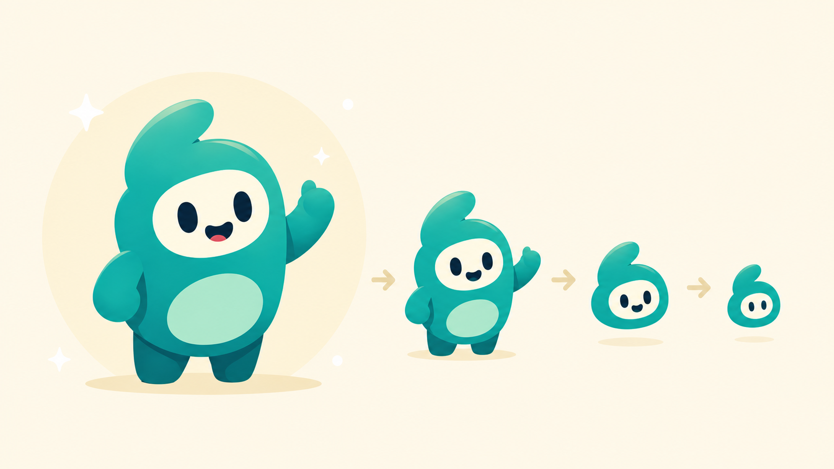
There’s a moment in every mascot project where someone asks: “but what does it look like at favicon size?”
The honest answer, for most mascots, is: bad. It looks like a smudge. You can tell something is there, vaguely round, vaguely a creature, but the specific character that took eight weeks to develop is gone. The team works around it by using a separate logo for small applications, splitting the brand identity into two parallel systems, and quietly hoping no one notices.
This is the central design problem in mascot work, and almost no one talks about it directly. Your mascot has to be a character (with personality, expression, a body that can move) and a logomark (legible at 16 pixels, monochrome-compatible, distinctive in silhouette) at the same time. These two requirements pull in opposite directions, and reconciling them is what separates mascots that become brand infrastructure from mascots that get retired in the next rebrand.
The two opposing requirements
A good character has range. It can be happy, sad, confused, excited. The limbs gesture, the eyes emote, the body can be posed. The more of these capabilities the character has, the more useful it is across marketing, product, and content.
A good logomark has none of these things. A logomark is a fixed mark. It reads the same at every size and in every context. The silhouette is distinctive enough that you could pick it out of a lineup of black shapes. It doesn’t pose or gesture. It just is.
The conflict is structural. A character with a wide expressive range needs facial features that change. A logomark needs facial features that don’t. A character is built to be deployed across contexts. A logomark is built to be the same across contexts. Most mascot briefs ignore this conflict and the result is a character that works as a character but fails as a logo, or a logo that works as a logo but feels flat when you try to animate it.
Why teams usually solve this the wrong way
The default fix is to design two assets: a “full mascot” version for big applications (illustrations, social, merch) and a simplified “logo mark” version for small applications (favicons, app icons, embroidery). The mascot has details. The logomark strips them out.
It sounds sensible. It is a mistake.
What goes wrong is drift. The two versions start as siblings. The mascot illustrator updates the character’s expression library, the brand team updates the logomark’s geometry, and after a year the favicon looks like a distant cousin of the mascot. Recognition collapses. The audience now has to learn two things instead of one.
The bigger problem is conceptual. If your mascot needs a simplified logo version, your mascot wasn’t designed to be a brand identity. It was designed to be a character that you’re now trying to bolt onto a brand identity after the fact.
The mascots that win don’t do this. Duo is Duo at every size. The favicon, the app icon, the marketing illustration, the merchandise: same character, same silhouette, scaling down without losing identity. Same with the Mailchimp Freddie head, the Headspace dot, and Octocat’s base form. These designs were built from the start to be both things at once.
The four constraints that make it work
A mascot that doubles as a logomark obeys four constraints. These aren’t style preferences. They’re geometric requirements, and you can test for them.
The silhouette has to be identifiable in black-only
Fill the entire character with solid black. Can you still tell what it is? Can you tell which character it is, distinct from other mascots in your category? If the answer is no, the character is doing too much of its work in detail and color. Strip features until the silhouette holds up alone.
This is why a lot of beloved characters have one weird shape feature. Duo’s body is an asymmetric blob with a beak. Mojo has one antenna. Headspace’s dot has nothing but a circle and two eye-shapes. The weirdness is load-bearing. It’s what makes the silhouette unmistakable.
The face has to read at small sizes
Most mascot faces have four to six elements: two eyes, a nose, a mouth, sometimes eyebrows, sometimes ears. At 16 pixels, you have maybe 200 pixels of total face area to work with. You cannot fit six features into 200 pixels and have any of them be legible.
The fix is to identify the two facial elements that carry the most character and make those work at small sizes. For Duo it’s the eyes. For Wumpus it’s the open mouth. For Mojo it’s the antenna shape, which isn’t a face element but does the same job. Everything else is allowed to degrade or disappear at small sizes. The two core elements are not.
The character has to work in pure monochrome
Most modern brand systems need a one-color version for embossing, embroidery, single-color print, dark mode, light mode, and small UI placements. If your mascot relies on color contrast to be readable (light belly, dark back, colored accents), it will fail in monochrome, and you’ll quietly start using your wordmark instead.
The test: render the character in 100% black on white, then 100% white on black. If either version loses critical identifying features, the character isn’t logomark-ready. Common failure: the eyes disappear because they were a color that’s now the background. Fix at the design stage, not in production.
The head has to be self-contained
This constraint is an easy one to miss. A character whose identity depends on its body (its limbs, its props, its outfit) cannot be cropped for small-size applications. A character whose identity lives in the head can be cropped to a head-and-shoulders, then to a head, then to a face, and still read as itself.
Look at Mailchimp. Freddie has a body. Freddie’s logomark is just his face. The face was designed to work alone, which means the brand can use it everywhere a small mark is needed without designing a separate asset. Compare to a mascot whose recognizable feature is, say, a specific outfit or pose. That mascot will never logomark cleanly because its identity isn’t portable.
What this means if you’re commissioning a mascot
If you’re hiring a studio to design a mascot, here are the questions to ask before approving anything:
What does this character look like as a black silhouette? What does its face look like at favicon size? Does it work in one color? Can the head stand alone without the body? Will the same asset work for the app icon and the trade show banner, or will we end up maintaining two versions?
If the studio answers “we’ll make a simplified version for small applications,” that’s a yellow flag. They’re solving the problem with two assets instead of one design. Push back. Ask what the character would have to lose to become its own logomark. The answer reveals whether the character was designed with this constraint in mind or whether it was designed as an illustration that happens to be a mascot.
The mascots that become brand infrastructure (the ones you tattoo on yourself, the ones that survive three rebrands) are the ones where character and logomark are the same object. That’s not a style. It’s a discipline, and it has to be built in from the first sketch.
We design mascots that are built to function as logomarks from the start, not retrofitted into one. If you’re considering commissioning a character or your existing mascot is breaking at small sizes, we’d love to talk.