5 min read
The problem with perpetually happy mascots
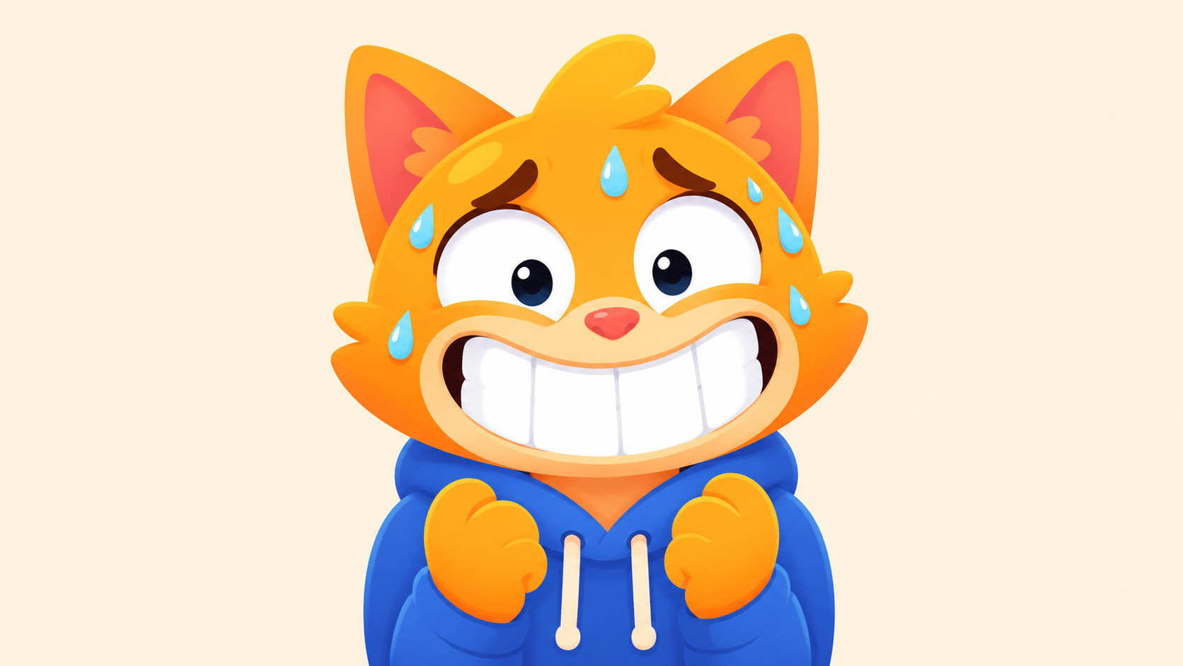
Most mascot briefs we receive ask for a character that is “friendly,” “approachable,” “warm,” “welcoming,” and “fun.” They almost never ask for a character that can be sad, embarrassed, tired, smug, anxious, or annoyed.
This is a problem. A mascot that can only do “friendly” is a mascot you can only deploy when nothing is going wrong, which means a mascot you mostly cannot deploy.
The case for emotional range is the most underrated craft question in mascot design, and once you see it, you can’t unsee it in the work.
What a mascot is for
Strip away the marketing language for a second. A mascot is a substitute face for a brand that doesn’t have a human face. Its job is to make a faceless thing (an app, a company, a service) feel like it has interiority, like there’s somebody home.
People are not a single emotion. They get happy when things go well, frustrated when things break, embarrassed when they make mistakes, tired in the afternoon, excited about good news. A brand that wants to feel like a person needs a mascot that can do all of those things, because the moments when a brand most needs to feel human are the moments when something is not going well.
Think about where your brand needs presence the most. The user just got an error. They just lost their work, or were billed for something they didn’t expect, or abandoned a flow halfway through. These are the moments where good brand identity does its hardest work, and a perpetually-grinning mascot is useless in every one of them.
The Duo case
Duo, the Duolingo owl, is the most-studied mascot of the last decade for a reason, and the reason is not that he’s cute. The reason is that Duo can be passive-aggressive. He can guilt-trip you, be disappointed in you, be quietly furious that you missed your Spanish lesson.
This range is what made Duo a meme. It’s also what makes Duo a useful product feature. When you’re about to lose your streak, Duo can be the character who is sad about it, which is more effective at getting you to open the app than a notification that says “you’re about to lose your streak” with no emotional valence at all.
The Duolingo team didn’t stumble into this. The character was designed to have an unhappy mode. The eyebrows can angle inward, the eyes can narrow, the body posture can close. These were decisions made early enough that they’re now baked into the rig, which means the character can be deployed in moments where most mascots would have nothing to say.
The test most briefs fail
Here’s the test we run early in every mascot project. We sketch the character in five emotional states:
- Happy (the default everyone asks for)
- Sad
- Embarrassed
- Determined
- Annoyed
If any of these are hard to draw without changing the character significantly, we’ve designed the character wrong, and we go back to the silhouette.
The trap is designing a character whose entire visual identity is “happy.” The smile gets built into the face shape, the body posture is permanently upbeat, the eyes are wide open and shiny. To make this character sad, you have to mutate it into something that no longer looks like itself.
The fix is to design the neutral state first. A neutral mascot face is one where the character is recognizably itself without expressing anything in particular. From neutral, you can layer happy, sad, embarrassed, determined, or annoyed by changing one or two elements (eyebrow angle, mouth shape, eye openness) without disturbing the core silhouette. This is how cartoonists have worked for a century. It’s how every great mascot is built. And it’s not what most briefs ask for.
Why this is a logomark question too
The connection between emotional range and logomark function is closer than it looks.
A character whose visual identity is “smiling” cannot scale down without the smile dominating the entire mark. At small sizes, the smile is the loudest element, and it forces the character to read as relentlessly cheerful even when the brand is trying to express something else.
A character whose visual identity is the neutral state can scale down to a small mark that doesn’t pre-commit to any particular emotion. The mark is just “the character,” and emotion gets layered in at the larger sizes where there’s room for it. This is part of why Duo, Wumpus, Octocat, and Headspace’s dot all work as both characters and logomarks: their default state is neutral, not happy, which means the small-size version doesn’t lock the brand into a single mood.
If your mascot can’t do neutral, it probably can’t do logomark either. The two problems are the same problem.
Practical steps if you’re designing one
A few things to do at the brief and sketch stage to make sure you end up with a character that can credibly feel something.
Specify the emotional range in the brief
Not “friendly and warm,” but “the character needs to credibly express disappointment, embarrassment, and quiet pride.” Force the studio to design for the range, not just for the hero pose.
Ask to see the sad version before approving the happy one
This sounds counterintuitive but it’s the strongest move available to you as a client. The happy version is easy. The sad version is where you find out whether the character has a real face or just a happy face.
Test the character without the smile
Cover the mouth in any sketch the studio shows you. Is the character still recognizable? Still expressive? Still on-brand? If the mouth is doing all the work, the character is built on a single point of failure.
Build neutral as the default state in your guidelines
When the mascot appears in product or marketing without a specific emotional purpose, it should be neutral, not smiling. That makes happy a deliberate choice when the brand wants to express it, instead of a default that gets diluted by overuse.
What you get from a mascot with range
A mascot that can feel becomes useful in places a mascot that only smiles cannot. It can occupy your error states without feeling tone-deaf. It can show up in your apology emails without making the apology worse. It can express the brand’s response to a bad quarter, a tough industry moment, or a piece of news that calls for something other than enthusiasm.
It becomes the brand’s face in any weather. That’s the asset that compounds over years. The decorative smiling version decays the moment your business has a hard month.
Most mascots don’t have this. The ones that do are the ones you remember.
We design mascots built for emotional range, not just hero poses. If you’re starting a project or you have a mascot that only works when things are going well, we’d love to talk.