3 min read
Why AI assistants keep growing faces
AI mascot design is becoming interface design. A face tells users how an assistant behaves before the first prompt is typed.
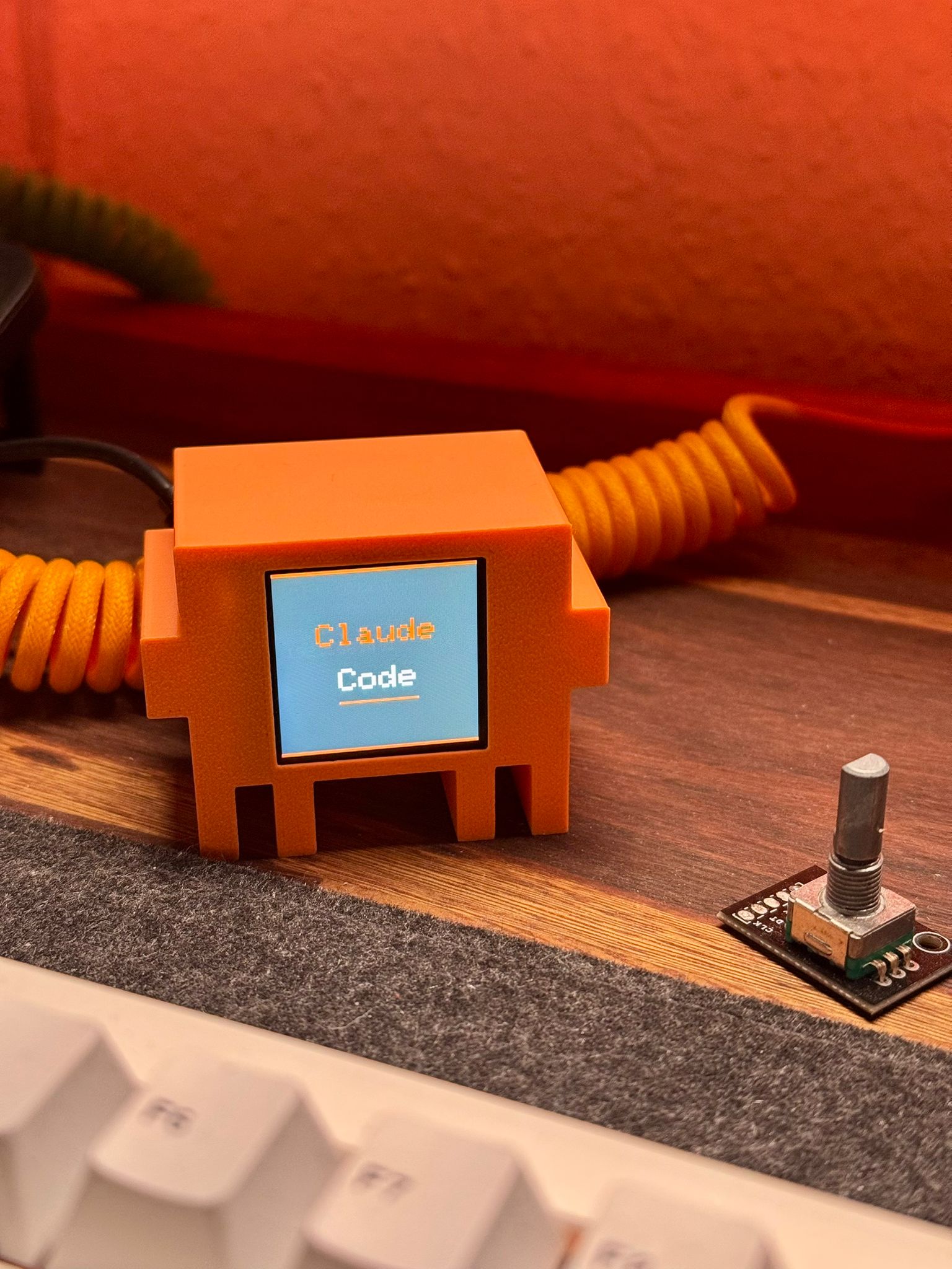
Claude Code’s orange character has escaped the terminal and become a physical object. Image collected in the Mascot Atlas.
AI companies have built products that write, reason and talk back. Then they represent them with a sparkle icon. This may be the largest gap between product ambition and brand imagination in tech.
The new crop of AI mascots is interesting because it is trying to close that gap. Claude Code has Clawd, an orange creature that looks as if it crawled out of an old terminal. OpenAI’s Codex has tiny pixel workers. Notion AI has a face made from one economical line. These are not pictures of intelligence. They are competing answers to a harder question: what should intelligence feel like while it works for you?
Claude Code made the command line touchable
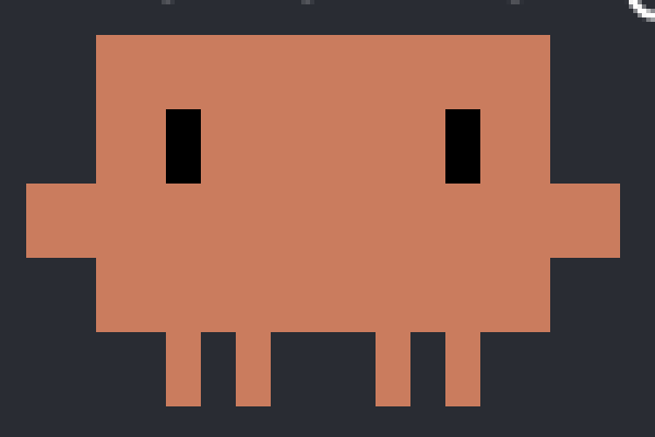
Clawd is a strange choice in the best sense. The blocky body and terminal-orange color make the character feel native to a developer tool. It has almost no facial detail. The design does not ask us to believe there is a tiny human inside the model.
Then the community made it physical. The desk version in the hero photograph turns an invisible coding system into something you could keep beside your keyboard. That transition matters. AI software is abstract by default. A mascot gives the abstraction a body, even when that body is four orange legs and a screen.
The AI mascot is becoming the hardware the software never had.
This is stronger than putting a generic robot beside a prompt box. The form tells you where the product came from. It belongs near cables, keyboards and blinking cursors.
Codex turns waiting into a performance
Coding agents spend time doing things the user cannot see. They inspect files. They run commands. Sometimes they fail. A progress spinner compresses all of that into rotation.
The Codex Buddies sprite sheet takes another approach. The little worker walks, sits at a laptop, reacts and enters a failure state. Those poses could turn system status into character performance. The mascot has a job inside the interface rather than standing beside it for decoration.
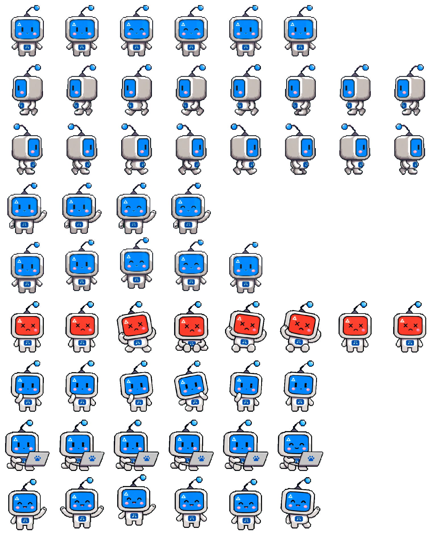
This is where mascot design starts becoming interaction design. The useful question is no longer “does it look friendly?” Ask what state the character can explain better than a label or spinner.
Notion AI barely becomes a person
Notion’s AI face sits at the opposite end of the spectrum. One line suggests a nose and brow. Two dots supply the eyes. It is closer to a typographic mark than a cartoon character.
That restraint suits a tool that appears inside somebody else’s document. A louder mascot would compete with the work. The face announces presence, then gets out of the way.
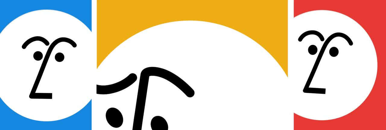
Clawd gives AI a physical body. Codex gives it visible labor. Notion gives it a quiet presence. Those are three different product strategies, which is why they produce three different characters.
A face makes the product easier to judge
Once an assistant has eyes, every response becomes a performance. A gentle face paired with a cold refusal feels inconsistent. A mischievous character delivering legal copy feels possessed. Personality raises expectations that the product team must keep.
The brief therefore has to start with behavior. What does this character do while it thinks? How does it admit uncertainty? When should it disappear? What happens after failure? A turnaround sheet cannot settle those questions.
AI products do not need mascots. They do need a legible relationship with the user. A character earns its place when it makes that relationship easier to understand.
See how we build character systems for products that need more than an icon.